
Tablet for care home tenants
The project centred around analyzing the usage statistics of CleverCog Digital System and creating visualizations that effectively communicate our findings.
In this project, I collaborated with 3 graphic designers and 1 web designer to analyze user data from a quantitative user research perspective. My role involved investigating the underlying reasons behind the connections in the data and providing insights to support data storytelling. To visualize the data in an engaging and interactive way, I utilized programming skills to generate web-based graphs.
Out of respect for data privacy concerns, certain analysis results are not disclosed.
CHALLENGE
Our aim was to examine tablet usage among individuals with disabilities in care homes and create a reference for Blackwood developers to guide software iterations and enhance user engagement in a clear and understandable way.
OUTCOME
An online report and a booklet were created to present the data analysis. Our analysis focused on user behaviour before and after the epidemic, and we employed clustering algorithms to distill typical user profiles. By incorporating personal reports and data comics, we aimed to tell the story of our findings in a way that is accessible and engaging to a wide range of audiences.
BACKGROUND
Blackwood Homes and Care was founded in 1972 providing high quality housing, care and support for disabled people of all ages, with over 1700 homes across all 29 mainland local authorities in Scotland. As an investment in innovation, CleverCogs Digital System was designed to develop a modern standard for accessible homes, combining technology, modern construction, and engagement with people who live with a disability to design and produce beautiful, easy to use homes.
CleverCogs Digital System enables tenants to access many of Blackwood’s services online. It is a customisable system, each cog links to a new range of services like Care, Health, Local Information, Communication and Entertainment. Users simply use the cogs they need, for example the Family and Friends cog so they can video chat. All tenants can have WiFi connectivity in their home, be offered a Blackwood tablet device, free digital skills training for all levels to get online with confidence and ease as well as the CleverCogs Digital System.
DATA RESOURCE
The data sets provided by the data host describe the personal information and the activity information of CleverCogs users. After data processing, we got a cleaned data set with 546 users and 592108 user activity records from January 2018 to November 2021.
DATA ANALYSIS
We explored over 1.4 million data points from various sources. This extensive analysis required careful planning, data preprocessing, and validation to ensure accuracy and relevance. Through meticulous data analysis, uncovered key insights into usage trends and discovered previously unknown correlations. This analysis not only highlighted user preferences and pain points but also revealed opportunities for improving digital engagement for individuals with disabilities.
Out of respect for data privacy concerns, certain analysis results are not disclosed.
Basic information analysis
Analyzed the number of users, the number of activities and the distribution of age, property type, health issue, and location.
Activity analysis
-
Selected several popular activities for deeper exploration because types of activities are more than thousands
-
Cross-analyzed the activities data with other basic information
-
Plotted the accumulated times from different frequency perspectives to see if there is a periodic or seasonal pattern.
-
Did a cross-comparison of the rank in each category and the rank of all the activities. To avoid biases of ranks being screwed by particular users who contribute too much in a particular activity, we took care in properly reasoning by examining the distribution of contribution of unique users
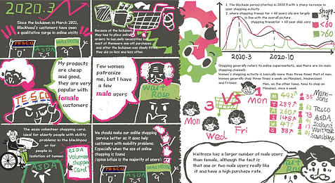
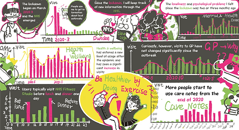
Covid impact analysis
Analyzed the impact of Covid-19 on CleverCogs users mainly from the perspective of time.
User cluster analysis
Clustered the data using the K-means algorithm and by gender, age and location for each user because they are linear. The clustering effect is best when the value of K is 3, so the users of CleverCogs are divided into three categories.
Individual analysis
Made a personal report for users, mainly focusing on the following aspects of one single user. We only selected a typical CleverCogs user as a sample.
-
Time and spatial dimension: the length and frequency of use of CleverCogs, the age distribution of the user’s living places, etc.
-
Global dimension: the use rank of activity among all users, etc.
-
Recommendation activities: the activities that are loved by those who have the same interest as the user, etc.
Here I provide some screenshots of the Jupyter Notebook used for most data cleaning and exploration. The data processing and data analysis were finished through Python, Matplotlib, Plotly by me. Please use the arrow button on the right to load more.


DATA VISUALIZATION
We created a suite of interactive charts and data comics to communicate complex data findings in an intuitive and engaging manner, suitable for diverse stakeholders including caregivers, managers, and family members.
Main visual style
The challenge was to make it easier for users with health issues such as learning disabilities and Alzheimer's disease to understand the information.
-
Colour: used a soft and friendly beige as the main background colour; use brighter, more saturated colours to highlight the data and information; used the CleverCogs theme colours extensively in the pages and illustrations
-
Layout: incorporated a collage and hand-drawn style into the overall layout design to keep with the presentation of the data comics, created a familiar and friendly atmosphere for the user, and fitted in with the physical format of our booklet.
-
Font: used handwriting for the main fonts to match the overall style

Chart visualization design
-
Front-End: used HTML and CSS to establish the website; used JavaScript and Bootstrap to accomplish the interactive effect
-
Chart: used Echarts and Flourish as visualization tools. Echart is a visualization library based on javascript. Flourish is an online data graphics tool.
-
H5: used an H5 format to present the web-based personal report section, which has the advantage of being simple, clear and interactive; used a storytelling approach to present data, taking unique user behaviours to give users a sense of humanity from the calm data analysis
The interactive charts were produced through JavaScript, HTML, Echarts and Flourish by me. Below I provide some examples.
Data comics
A big focus of data comics is to make data storytelling. The aim was to have a storytelling quality without losing the objectivity of the data.
-
Distilled users into representative characters and let them describe some of their CleverCogs usage behaviours and habits through dialogues and questions
-
Anthropomorphized CleverCogs by creating two cog mascots in the brand's colours to present users with a more objective graphical representation of activity data
-
Divided information into different time dimensions to support the narrative strategy


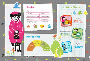
H5 personal report sample
Used an H5 format to present the web-based personal report section, taking advantage of being simple, clear and interactive.
We also used a storytelling approach to present data, taking unique user behaviours from the 2018-2021 period, to give users a sense of humanity from the calm data analysis. The design style followed the main style of the website to make users feel friendly and familiar.
Booklet
Design an eda physical booklet version of the individual report.
-
Perfectly blended with the website in terms of material selection and production as the main style of our website were hand-drawn and collage
-
A stronger sense of spatial dimensionality, giving users a stronger visual impact and a completely different form of interaction from the web experience
-
Enhance user stickiness, provide a way to share and increase brand influence